Here is the most depressing chart I've seen in some time:

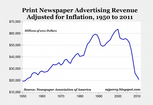
Basically we now take in the same amount we did in 1950, about $20 billion a year, which is still a nice piece of change. But:
Here is the most depressing chart I've seen in some time:

Basically we now take in the same amount we did in 1950, about $20 billion a year, which is still a nice piece of change. But: